Knowing the basics of color theory can help you decide which color combinations are the right fit for your brand. This article has been written as a complete guide to color theory to aid you on your colorful journey.
To kick things off with this complete guide to color theory, let’s start by answering; what is color theory? Color theory is the science of using color. It’s all about how colors mix and match with one another, how we visualize the color, and what different colors mean to different people.
When you have a brand, consistency is essential. You want to make sure your logo, typography, and design look and feel the same across all your marketing materials.
It’s essential to make sure the colors you use are consistent too. Color can boost brand recognition by up to 80%, making it easier for potential customers to spot your products.
Think of Coca-Cola and its iconic red and white branding, or Google’s bright and colorful logo. Various color combinations can make a real impact.
Table of Contents
RGB vs CYMK
Let’s start with the two main color models, and how you can use them to craft the perfect logo.
RGB color model (additive color model)

The RGB color model is an additive color model, where three colors of light (red, green, and blue) are combined to create new color combinations. For example, red and blue together create magenta (purple), while green and red make yellow. If you add all three colors together, you get pure white.
Televisions, digital cameras, and video cameras use the RGB color model, mixing red, green, and blue light to build up other colors.
CMYK color model (subtractive color model)
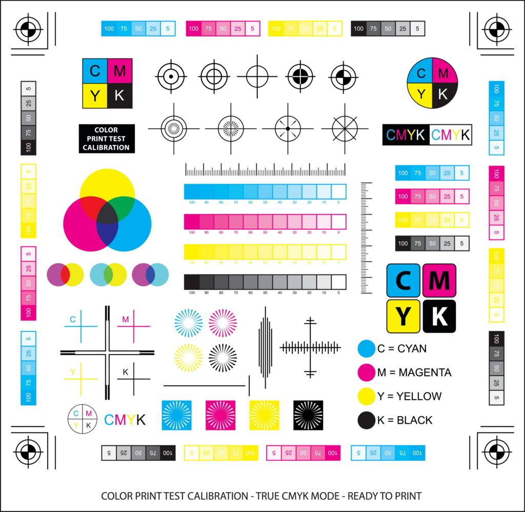
The CMYK color model is an subtractive color model. Cyan, magenta, yellow and black can be overlaid with one another to create new colors. For example, mixing yellow and cyan gives you green, while magenta and yellow give you red.

This color model is used in printers to produce all the different colors you need on paper.
So, what’s the difference between RGB and CMYK?
The RGB color model is best used for any design that is to be viewed on a screen. (for example, your website, smartphone or social media platforms), while the CMYK color model is best used for any design that is to be printed. Such as leaflets, brochures, and brand packaging.
With the additive color model, you’re adding light to color to get new colors, while with the subtractive color model, you’re removing light from color to get new colors.
If you use the CMYK color model on your on-screen designs, they will look muddy and murky. Conversely, the colors won’t be as accurate if you use the RGB color model on your printed content.
Introducing the color wheel
So, we now know how to create a variety of colors, as well as which color model is the right one for each marketing medium. The next step in color theory is the color wheel.
What do the color wheel and gravity have in common? They were both discovered by the same person! Sir Isaac Newton was responsible for mapping the first color wheel, back in the 17th century.
The colors of the color wheel
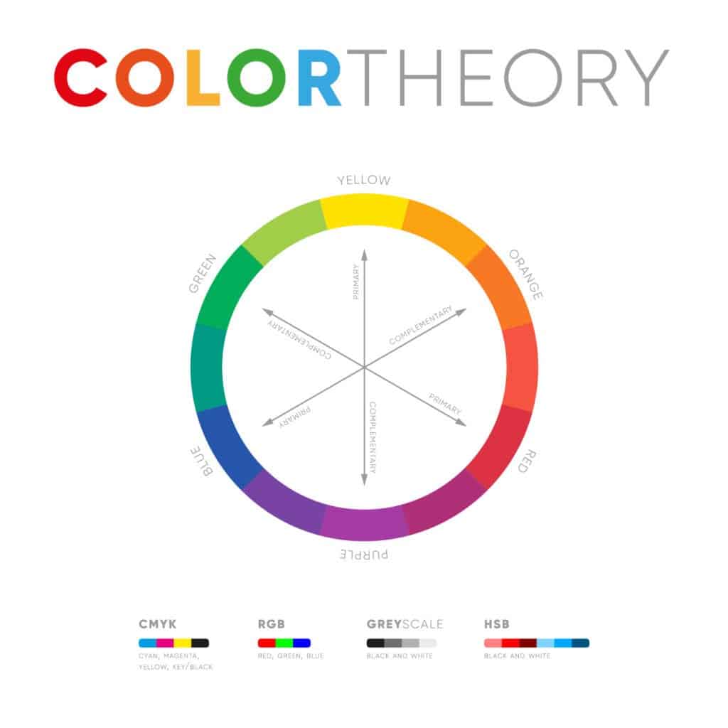
Graphic designers use the color wheel to determine which colors work well together. It starts with the three primary colors – red, yellow, and blue.
Between the primary colors sit the secondary colors, which are created when the primary colors are mixed together – green, orange, and purple.
Finally, the tertiary colors are created when the primary and secondary colors are mixed together. These are red-orange, yellow-orange, yellow-green, blue-green, blue-violet, and red-violet.
So, how can the color wheel help you choose the right colors for your brand?
Warm and cool colors
The color wheel can be split in half, with warm colors on one side and cool colors on the other. Warm colors are typically used to convey energy and passion, while cool colors are used to provide a calm and relaxing mood.
This can help you determine which colors best reflect the personality of your brand.
Color Schemes
Not all brands use just one color. Think of the red and yellow of McDonald’s, the blue, green, and orange of Fanta… even the red, green, yellow, and blue of Microsoft.
How do brands know which colors work well together? Through plotting different points on the color wheel.
Complementary colors
Opposite colors on the wheel are known as complementary colors. These colors contrast each other well, meaning they can be used to create a high-contrast brand identity that stands out. Think Hallmark and its striking purple and yellow branding, or Mountain Dew’s red and green logo.
Analogous colors
These three colors sit next to each other on the color wheel. With this color scheme, you will find that one color stands out while the other two provide a nice accent. Consider the BP logo – which uses the two greens on the color wheel and a sunny yellow in the middle.
Triadic color scheme
Triadic color schemes use three colors equally spaced out around the wheel in a triangle formation. These colors are typically big, bold, and confident. One of the best uses of the triadic color scheme is Firefox, which combines blue, red, and orange to create a logo that really pops
Hues, Shades, Tints, and Tones
You may be thinking: ‘hang on, there are more than twelve colors I can use in my logo’… and you would be right!
You can create additional colors by adding shades, tints, and tones to the colors on the wheel.
- A hue is a pure color as it is on the color wheel
- A shade is a hue with black added
- A tint is a hue with white added
- A tone is a hue with grey added
This opens up the color wheel even further and gives you more colors to play with.
To Conclude A Complete Guide to Color Theory
To conclude, a solid knowledge of color theory can help you choose the right colors for your brand and ensure your branding looks great, wherever it is used.
Color’s importance and impact on a brand are huge to the overall brand image. Color often doesn’t get the attention it deserves.
We hope this article helps you better understand color theory and the power it holds to a brand’s image. Finally and most importantly we hope this complete guide to color theory is a valuable resource for your brand and color journey. If you are interested in learning more about branding, we have loads of awesome articles here.
