Choosing the right typeface for your brand deserves as much attention to your brand identity as you put into logo creation and color. A typeface can tell people a lot about your business and your tone of voice. A playful business using a serious typeface can easily send out the wrong message, all without saying a single word.
When you’re looking at your business’s brand identity, there are a lot of different things to consider. From your logo to the colors on your website and leaflets.
However, it’s equally important to think about the typeface you plan to use.
In this article, we take a look at how to choose a typeface that best complements your brand.
Table of Contents
What is a typeface?
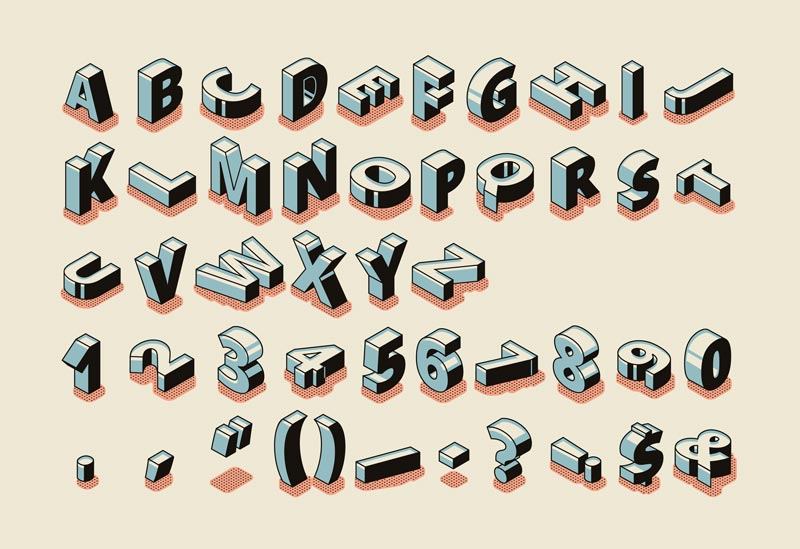
A typeface is a set of letters and numbers that share a similar design. For example, Futura, Helvetica, and Gill Sans are all examples of typefaces you can use.
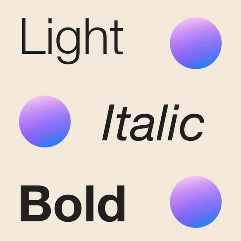
Many people use the terms font and typeface interchangeably, but technically the two are different. A font is a variation of a typeface, where a typeface is a complete set of characters with a common design running throughout. It is made up of a whole collection of fonts, each in a specific weight, style, and size. (Light, Regular, Bold, etc.

To clarify with an example; Helvetica would be the typeface. The font would be; Helvetica Bold 12 point.
Different Typeface Styles
There are a few classes of typefaces, but the main styles used today are serif, sans serif, script, monospaced, and display.
As a general rule, serif and sans serif typefaces are allrounders that are used primarily for either main body copy, headlines, or a mixture of both. However, not all serif and sans serif typefaces are equally suitable for both body and headline copy. Different typefaces are more legible than others at different sizes.
On the other hand, script and display typefaces are only used for headlines due to the legibility of script fonts on small sizes
Whilst, the spacing of Monospaced typefaces makes them ideal for displaying code. They can also be used for body and headline copy. Originally, typewriters used Monospaced typefaces due to the equal spacing making them more legible to read.
Why it’s important to choose the right typeface for your brand
The right typeface helps promote the message your brand is trying to convey.
For example, let’s say you are looking for an accounting agency to help you with your taxes. Your search has found you two accountants that are very similar to one another – apart from when it comes to the typefaces they use.
One agency uses Gill Sans – a timeless typeface with a modern twist. This typeface is used by brands including the BBC, Tommy Hilfiger, and John Lewis.
The other uses Comic Sans – a typeface that was initially created for comic strips and is not seen as a professional typeface for businesses to use.
Which agency do you choose to work with, based on the typeface they have adopted? We’re guessing it’s Gill Sans every single time!
The questions to consider when choosing the right typeface for your brand

Choosing the right typeface for your brand can be tricky. You know you need to pick a typeface that best represents your brand, but the next question to consider is… which one?
Whatfontis has a catalog of over 850,000 fonts, so there are many different options!
Here are a few questions you can ask yourself to narrow your choices down.
Does the typeface represent your brand and what you want to achieve?
Think about your tone of voice. If your tone of voice is fun, playful, and a little bit cheeky, you’ll want a typeface to match. We have a great article explaining everything you need to know about Tone of Voice for your brand here.
Take Twitter – which uses Pico in its logo. Pico is a soft, round typeface that shows Twitter is a casual and friendly place for people to hang out. If the social media platform used a more angular, harsher typeface like Times New Roman, it might result in a disconnect with its target audience.
Conversely, many fashion brands like Giorgio Armani and Zara use a typeface called Didot. This thin and elegant typeface represents the high-fashion and exceptional quality these brands offer their customers. A larger, chunkier typeface may cheapen these luxury brands.
Think about your goals and what you want your target audience to think when they see the typeface you use.
Does the typeface have any connotations with other brands?
Sometimes typefaces can be so well-associated with certain brands that using them may be to your business’s detriment.
For example, take the bespoke typeface used in the Disney logo, based on a stylized version of Walt Disney’s signature. This typeface has become so well associated with Disney, that it may harm your brand to use it.
(Sidenote; typefaces may be eligible for copyright in some countries. You may need to consider this when choosing a typeface for your brand.)
Does the typeface have a lot of flexibility?
If you plan to use your typeface in many different ways, you will want to use a typeface with several different variations.
As an example, Helvetica Neue comes in over 50 variants, including ultra-light, thin condensed, roman, medium italic, and extra black condensed oblique! This means there are plenty of options if you want to keep your brand identity constant.
Alternatively, are there other typefaces you can pair your primary typeface with? Sites like Fontjoy are great for helping you find combinations of typefaces that work well together and have enough of a contrast to keep your content interesting!
Other criteria you need to bear in mind when choosing the right typeface for your brand
Here are some other things you need to consider when choosing a typeface for your brand.

Size
You want to make sure any typeface you use is easy to read, but not so large that it dominates your page. Experiment with different font sizes and see which is right for you.
Color
The color of your typeface can be just as critical as the style of typeface you use. For example, take eBay and Unicef, which use the same typeface (Univers) but in different colors.
Think about what your brand represents and the colors that will help you showcase your goals and values.
Leading and tracking/kerning
White space is critical when it comes to design, and the amount of space you use with your typeface can make it look hugely different.
Leading is the amount of space between each line of content. Typically, larger fonts need more leading.
Tracking and kerning is how much space there is between letters. It is referred to as tracking if you are adjusting spacing uniformly between all characters and kerning if you are adjusting the space difference between individual characters.
Leading, tracking, and kerning not only make your design clearer and easier to read but can make it distinctive and uniquely yours.
In conclusion
We hope this guide has given you valuable insight into choosing the right typeface for your brand.
If you’re still stuck, take a look at your favorite websites and see what typefaces resonate with you. Seeing what your competitors use can also help you get valuable insight into what your customers like.
Don’t be afraid to experiment and try something new when it comes to choosing the right typeface for your brand.
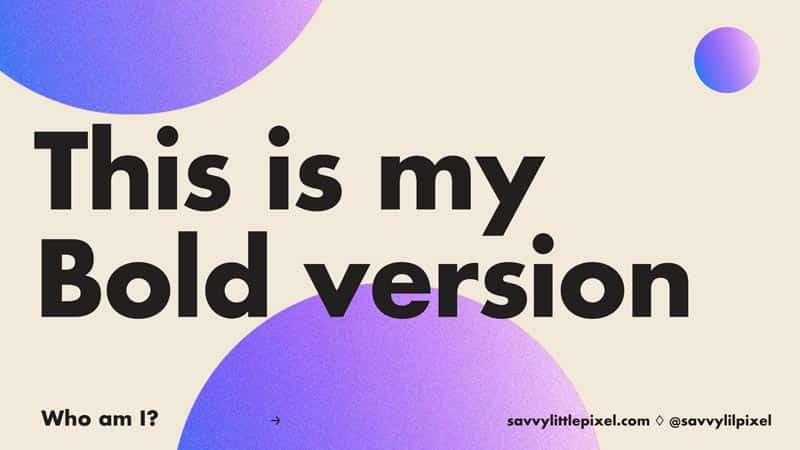
Answer to Question
If you’re looking for the answer to the question earlier in the article, the correct answer is Futura, congrats if you were correct!
