Choosing the perfect brand colors is incredibly important. According to research by Xerox, using colors to manifest critical messages enhances attention by 82% and brand recognition by 80%. With these verifiable statistics, brand color plays a crucial role in communicating the essence of your brand image. Choosing the right colors for your brand identity can be a daunting task. While the options are endless. It’s important to remember that research is key to selecting colors because they carry an emotional weight that shapes consumer perceptions. Colors have a lot of power when it comes to the development of a brand identity system.
In this blog article, you’ll learn how to draw inspiration for color and aid you in choosing the perfect brand colors.
Table of Contents
Ways color can have an impression on people
- Assists customers in shaping the brand image and affecting purchase motivation.
- Aids customers into building a relationship with the brand.
- Conveys the identity of the brand.
Where to source inspiration?
Choosing the right colors can be difficult when you’re building your brand identity. Many things play into it; the personality, sector, audience, current trends, goals, customer perception, etc. However, choosing your brand colors is not all that complicated! Color surrounds us in our day-to-day, so the inspiration is everywhere to be found.

Here, we explain several tips for creating stunning color palettes that fit right into your brand image.
Capture inspiration on the go
When you’ve been away from the office, doing meal prep, or traveling, the best source of inspiration can be anywhere. Take the time to really look at everything in your day-to-day. The more you pay attention, the more the colors will inspire your work. They’re out there, just waiting to help push your creative projects into a new market. Remember that nature is the best source of inspiration.
Use a color wheel
A color wheel can be an incredibly useful tool when creating color schemes. What color do you feel represents the brand best? Once you have found the color that best fits your product and environment, select a complementary color. You can do this by using the opposite color to yours on the color wheel. Together they will compliment each other perfectly.
Borrow from interior design
Consider borrowing color schemes from other design industries. Interior design is a great source of inspiration because it’s so heavily documented.

Magazines, real-estate sites, open houses, inspiration boards on Pinterest, Instagram, even paint samples from DIY stores. There are countless sources of inspiration for interior design.
Save what works best
Whenever you see a picture or photo with colors that got your attention, save it as you never know when the need for it might arise. Create a folder full of clippings of colors. Try to prioritize saving real physical forms of color over online versions such as Pinterest boards. Online sources are amazing however there is no substitute to having the color in person to interact with.
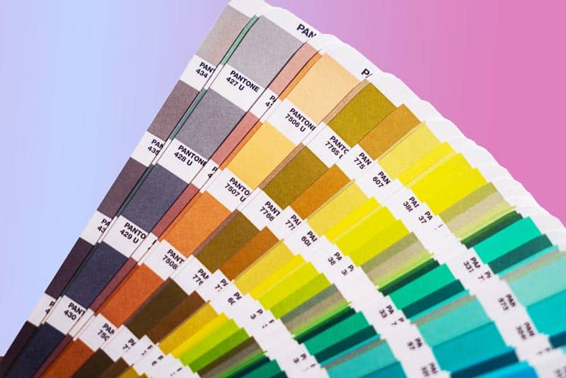
Dust off the trusty Pantone set
If you’re completely stuck for inspiration, try using a color matching book such as a Pantone color set. Pantone sets (and other similar cheaper generic color sets) can be very useful.

They give you access to thousands of shades of pretty much every color possible. Having color in a format that allows interaction, is a brilliant exercise that will be sure to spark some creativity within.
Stick to 3 or 4 colors
Keep the number of different colors in a design to 3-4 max. If you need to tone down a design but don’t want to reduce the number of colors. A good trick is to play with textures.
It’s very easy to overdo color and leave the viewer overwhelmed. Don’t forget that color is loud, so having too much volume can be a bad thing. Furthermore having too loud of a design can isolate certain people that struggle to process the design. It’s best to refine and never overdo.
Color Psychology
Colors are powerful tools that evoke emotions in branding. Color psychology is a form of subconscious psychology that helps you to visualize the desired outcome. While color psychology may have different implications for different aspects of your brand. They ensure your customers purchase your product faster with greater levels of confidence.

For example, the color blue most likely triggers thoughts of trust, loyalty, and sensuality. Conversely, red typically triggers associations with the most critical aspects of your brand… passion, energy gathering, and drive. We have an article that goes deep into color theory here, that we highly recommend checking out.
Search Pinterest for themed palettes
Having said earlier that interacting and saving physical forms of colors is always best. It may come as a surprise to read that we actually highly recommend using Pinterest. Pinterest is an excellent source of inspiration for finding many new color combinations quickly.
Try to view Pinterest as a form of secondary research and save a physical color as primary research. Both are vital and incredibly useful. However primary research will always be important but longer to achieve. On the other hand, secondary research can be achieved at a fraction of the time.
Follow websites
Websites such as Colourlovers.com offer unlimited color palettes and many different ways to use them in a branding strategy. You’ll find just under 5 million user-created color palettes. Yes, you read five million correctly.
Understand the brand
Blindly throwing color and seeing what sticks, is an option, albeit a bad one. The correct color options should be pretty obvious when you analyze your brand.

What is your brand? Who’s the brand’s target audience/market? What does the brand represent and what is its tone? First, you truly need to understand every aspect of your brand. This will allow you to have an educated point of view of what colors to use for your brand.
For example, a brand is called; Gaia Tech. What color should the logo be?- Your guess is as good as mine.
Let’s get some more information about Gaia Tech.
They develop cutting-edge renewable energy technology. Their technology allows the use of hydrogen as an energy source for a cleaner tomorrow. Knowing just a little bit more information can massively help.
Let’s re-ask; What color should the logo be?
Now it’s true that design is subjective and technically any color can be justified. However green should have been the obvious answer.
Conclusion
Irrespective of your color choice for your brand, make sure you take your time when picking colors. It’s all too easy to make a generic design in black and white, then add color later. However, this will always feel like a last-minute addition if it hasn’t truly been developed.
Spend time understanding your chosen color palettes. Experiment, and review until you get perfect results. Remember color is powerful and can elevate your brand. It’s important to get it right the first time around. We hope this article has been useful, educational and has shed some light on choosing the perfect brand colors.
